


brevr Members
-
Posts
16 -
Joined
-
Last visited
Content Type
Profiles
Forums
8Tracks
Events
Blogs
Posts posted by brevr
-
-
Oblivion I thought was one of the best RPG's this console generation, The level scaling is a little annoying though. But, all the content and replay value in the game kept me playing for close to a thousand hours
-
Oh man.. no, no do not take me seriously. I mean, on the feedback part I was serious but the thing about Bleck was joshing.
Maybe private message OA about an official thread. I really don't know.
Oh ok, ill figure that out later. I was mostly lookin if anyone was interested in the idea
-
I think we should leave that up to Bleck. He's a respected authority around here.

About your posters, it's a good start and shows an eye for design but you need to work on composition and color theory. Practice compositing too... take two really different images and put them on a background, tweaking them until the image has perfect unity. All your posters use negative space strangely too, which falls under the composition category.
Above all don't ever get discouraged. "Talent" is bullshit... if you practice for a long, long time and are open to feedback, you WILL get very good at design.
Okay, I didn't know who to go to about that thanks for clarifying
And thank you! thats the critisism i needed, I'm just getting into photoshop so i know there is a lot to improve on. Ill definate work on my composition thanks for the help

-
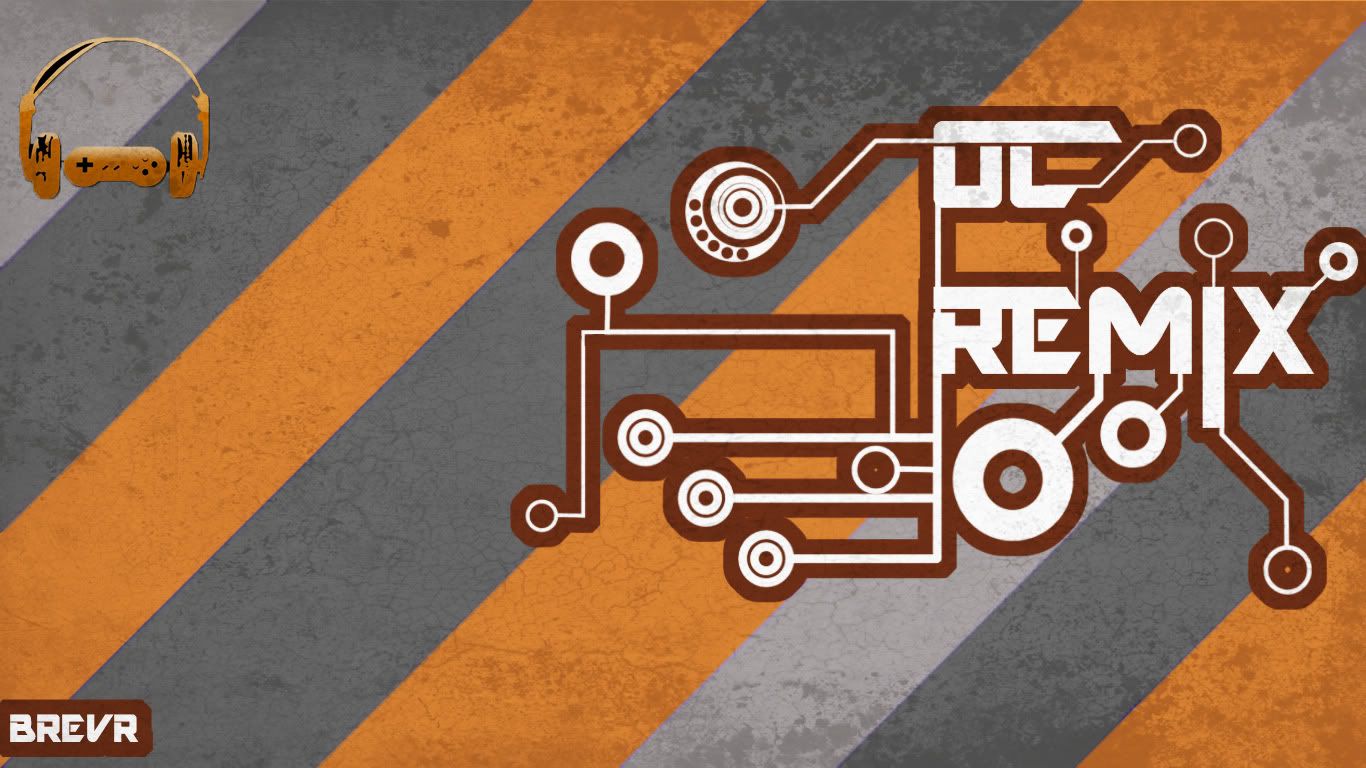
Hey, that logo right here is pretty slick.

I know the Iomanoid font is a trademark of the site's persona, but it'd be cool to use a new one sometime.
Maybe you guys could organize a community contest, to design the next OCR logo...
I have no idea what your talking about buddy
 Thanks for the complement though!
And this is to EVERYONE who cares - should there be a official fan art thread? Or a sub thread in the community section? I'm sure there are other OCR fans out there who are artisticly inclined so should I start up a official thread?
-
If you put pictures of all the judges in there it would make more sense.
Not too sure if it would make much sense in the picture actually... But prove me worng man i would like to see that idea done well
-
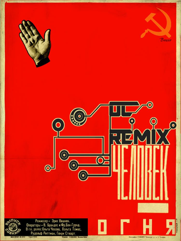
Eh, Maybe it's because I live so close to Russiah that I've seen so many Soviet propaganda posters, but that poster doesn't impress me much. What is that hand floating there on the left upper corner? Where are the proud men and women of USSR? Where are the glorious leaders of the people? Where is the national pride that overwhelms the puny Western nations?
I tried some ideas like that but none ended up looking very good. I decided go for a simple cold war era, pop-art style poster.
My inspiration was partially this guy.
-
?... sure thats what it means

-
@the damned - it's an homage to one of my favorite cold war posters. It's signifying Stalin in non ghost form. Plus I needed something to balance the poster out
And yes that includes shipping
-
I'll buy it. How much?
Free as fuck just tell people who ya got it from! ;D
-
Could you make one that looks like an old propaganda poster? Like, the logo in the middle, filling up the poster, and then some vaguely East Block style text beneath it?
That would be pretty fucking cool.
Decide for yourself

-
Could you make one that looks like an old propaganda poster? Like, the logo in the middle, filling up the poster, and then some vaguely East Block style text beneath it?
That would be pretty fucking cool.
can you send me a example? I think I know what your talking about it could be pretty awesome
And any other ideas for any OC, game, or anything photoshop would be greatly appreciated
-
Thanks for all the opinions! I didn't put much work into this, but i am glad to hear all the critism. The coulours don't go with anything OCR they're just... there. The logo is what i put all my work into so please judge that
the textures are pretty crappy too, I only had a few files to work form yesterday so overall this could have been a LOT better. I am testing the waters for something that isn't bad in the future. Thanks for the comments guys! -
oops. photobucket doesnt want to work right now... its only letting me post 1024x1024 as a max size
I'll see if I can't fix it later
-
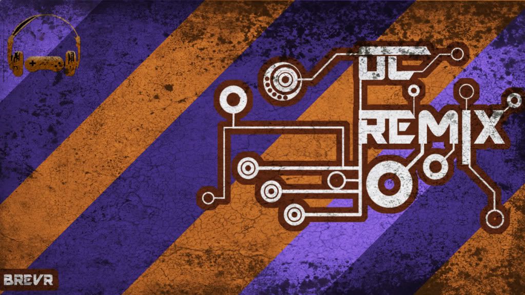
There ya go, i redid the pixel count so it should be a little more crisp
EDIT: Thats a more updated version that isn't as ugly. If you copy/paste into paint and resize it should look the same. I don't use imageshack anymore after it gave me some crazy viruses so sorry i cant size it perfect for you.
-
Something that I mocked up yesterday. I thought it would be nice to share
Any comments and criticism is appreciated. And suggestions for new work!!
Elder Scrolls 5: Skyrim
in General Discussion
Posted
I'm one of the biggest fanboys for the elder scrolls series, but skyrim has me worried... Morrowind IMO was the best RPG of the time and still the best in the series not taking into account the stupidly bad graphics compared to modern games. The essence of Elder scrolls is - and this is a direct quote from Morrowind's manual - "The goal is whatever you want it to be." Oblivion started to stray from this idea when it introduced the "new" sort of buggy levelling system. Between Morrowind and Oblivion, the developers removed 6 skills, 16 weapon types, and 7 spells. This was an acceptable loss, but an old fan could tell that oblivion felt streamlined in design. Skyrim by the looks of it has taken more cues from oblivion and is treamlining more and more facets of the game going so far to take out hand-to-hand, which personally doesn't matter to me, but it has been a skill in elder scrolls since day 1. I think that the developers are taking a backward approach to the design by removing instead of adding.
Thoughts?