

WesPip
-
Posts
894 -
Joined
-
Last visited
Content Type
Articles
Profiles
Forums
Events
Posts posted by WesPip
-
-
I not only voted, but registered to make future voting just slightly easier.
Huzzah!
-
You'd be wrong in doing that. There was an OCR clan previous to this one. This clan was rebirthed due to the inactivity of me and Decrescendo as overlords of the last clan.
What he said.
-
Pretty good episode, aside from the fact that I hate the voices you used to open the show

A lot of pointless rambling, but I've always been fond of needless banter so long as it's mildly amusing or better.
Also, I'd like to reassure you all:
VGDJ>>>>>>>>>>>>>>>>>>>>>>>>>>>>>>>>>>>>Harry Potter
...
And I'm saving that stinger.
Good job.
-
Peanut Butter Jelly Time on the next Family Guy. Woot. I've even spoken to the maker of that before... Time to tell him the news!
If by..next you mean...last week's.
-
Oh shit, it was the 25th wasn't it?
...
Wasn't someone supposed to remind me or something?
Dammit.
-
I'm..playing SCIII.
-
I miss VGDJ
Aw, poor girl.
*pat pat*
One day you'll return. One day.
*pats*
-
Wow, I didn't know Pip was a listener. He just rose five points.
...
I wouldn't make random criticisms.
That'd make me an asshole even by Unmod standards.
Well...not quite.
But i'd be close!
-
Ha, more crouching tiger hidden dragon music.
"Have a happy thanksgiving if you're american. If you're Canadian, just have a good week."
Awesome.
-
Bringing non-OCR people into the OCR clan is not fine.
QFE.
-
^
Silly people, Thanksgiving was about a month ago.
I will try to get on sometime in the not-too-distant future though.
-
That pixie bit.
Uhm..yeah.
And it had..Crouching Tiger, Hidden Dragon music in the background?
That's SO chinese. Tsk pixie, tsk.
BANNED AGAIN.
*coughs*
lol someone's beaming with sunshine and rainbows
Yeh wespip is an ass.. I dunno why he bothers listening..
Blame Unmod.
-
That pixie bit.
Uhm..yeah.
And it had..Crouching Tiger, Hidden Dragon music in the background?
That's SO chinese. Tsk pixie, tsk.
BANNED AGAIN.
*coughs*
-
^
Are you, perhaps, just clicking as opposed to clicking/dragging a certain sized box? Try resizing the text box..that...MIGHT work.
*shrugs*
-
Ha, well...I guess we need to keep pixie around to pronounce japanese names for the show, eh?
Well..I guess you're unbanned.
You're just lucky Rayza and Aurora can't understand japanese phoenetics.
edit: oh right, the show. Good stuff. I was also rooting for the KI mix, 'cause..it's an awesome piano mix and..yeah. Except the part where pixie talked about phlegm. Just..uh..yeah. No.
And..was..that..really pixie in the calls? Poor girl.
Lamest. Stinger. Ever.
-
Awww, but his name is DABEEN! I mean, come on, he's not just any been. He's DA been!

Sorry, but for saying that, you're banned for life from any and all activities anywhere, in perpetuity throughout the universe.
-
Yeah, got SC3 yesterday, it's awesome.
And...distracting.
From Halo2-related matters.
So..uhm...I assume SOMEONE took care of nem's invite by now, yes?
-
^
I was on hiatus a month or two ago 'cause of the FIRST Xenosaga. Then, I bought II last week..so..yeah.
I think I'm actually pretty close to done already, which is sad...'cause...I've only got 20 hours on it.
Nevertheless. Yeah.
-
What the hell... Err... Rayza did'ja have a cold or something? or... a hungover or something like that? Not to put you down... but you sounded awful!!
I was thinking the same thing.
Perhaps the second link in his sig is the answer...
-
...
Bought Xenosaga Episode II the other day.
Also, planning on buying SC III soon.
Then getting DDR Mario Mix for my bday.
...
I could be gone awhile.
-
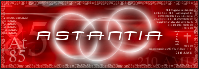
...I have a new name... and I want a new Sig!
Seriousely though, I did this one up in Paint in about ten minutes.

I would appreciate a more proffesional look.
The border going around the entire sig is the electron configuration of uncharged Astantine. I would like to keep that bordering the entire sig...
Also Astantia (my screen) should be centered and I like the three rings (if you have a nice suggestion for that, it's definitely changeable!)
The At and 85 on the side are just the Atomic symbol and number for Astantine. I would like those (together or seperate) anywhere on the sig, even backwards or upside down, I don't care.
The 210 AMU is 210 Atomic Mass Units... which I also like, but isn't a must.
The cross is a nice addition, but is not necesary, I just had to fill space.
The color scheme, black red and white, I like a lot. But am definitely open to suggestions!
Other than those things, do whatever you want! I really am humble suggesting this, and full credit will be given... I just want a nice sig sitting at the bottom of my posts...
Thanks in advance for even reading this request, and thanks for any help. (Man I wish I had photoshop...)
Here goes...
Nice.
-
...oddly enough, I have NEVER pronounced it like "Eric"...How very strange.
And good job getting Katamari, Rayza. Good job indeed.
And yeah, that stinger, I shall save.
-
^
Well, luminoire [sorry if that's not quite spelled right] makes some nice animated sigs, but they're a more subtle animation from what I've seen.
RedShadow has also made some pretty nice animated ones.
-
Not to go too off-topic or anything, but how long do yours usually take?
An average sig takes me about 20 minutes.
I'm just curious..'cause...mine certainly aren't generally much work.


Team OC ReMix [Halo2 Clan]
in General Discussion
Posted
Just use your Xbox dammit.
OR WE'LL KILL YOU.
Uhm...yeah.